
Customizing Look and Feel
Use CSS custom properties to override colors, typography, corners, and more. You can define them:
- Page-level CSS (affects all widgets on the page)
- Inline scoped CSS (affects a single widget)
- External stylesheet (maintained separately)
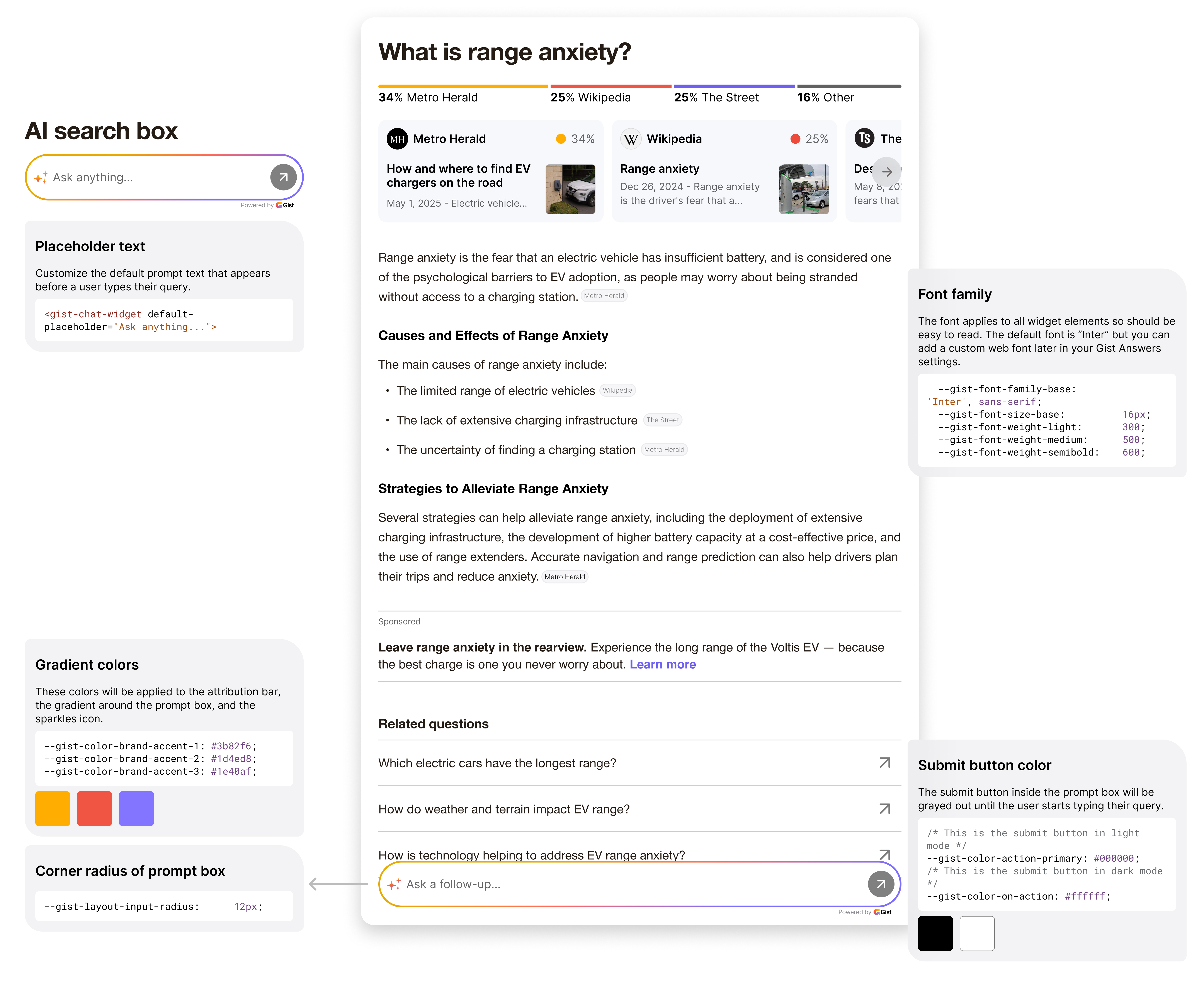
Commonly Customized Properties
See list and illustration below for the customizable properties of the widget.
:root {
  /* Brand Colors */
  --gist-color-action-primary:    #3b82f6;
  --gist-color-on-action: 				#ffffff;

  /* Text Colors */
  --gist-color-text-primary:       #1f2937;
  --gist-color-text-secondary:     #4b5563;
  --gist-color-text-placeholder:   #9ca3af;

  /* Backgrounds & Surfaces */
  --gist-color-surface-main:      #ffffff;
  --gist-color-surface-widget:    #f9fafb;

  /* Gradients */
  --gist-color-brand-accent-1:    #3b82f6;
  --gist-color-brand-accent-2:    #1d4ed8;
  --gist-color-brand-accent-3:    #1e40af;
  --gist-color-brand-accent-4:    #616161;

  /* Typography */
  --gist-font-family-base:        'Inter', sans-serif;
  --gist-font-size-base:          16px;
  --gist-font-weight-light:       300;
  --gist-font-weight-medium:      500;
  --gist-font-weight-semibold:    600;

  /* Corners & Radius */
  --gist-layout-input-radius:      12px;

  /* Icon & Sparkle Colors */
  --gist-color-icon-sparkles:     #f59e0b;
}
Simple Customization Examples
Below are quick-start examples. Wrap your widget in a <div> with a CSS class (or use global <style>) to scope your overrides.
Brand Colors
<style>
.my-brand {
  --gist-color-action-primary:   #e74c3c;
  --gist-color-brand-accent-1:  #e74c3c;
  --gist-color-brand-accent-2:    #c0392b;
  --gist-color-brand-accent-3:    #a93226;
}
</style>

<div class="my-brand">
  <gist-chat-widget default-placeholder="Ask about our **RED** products">
  </gist-chat-widget>
</div>
Dark Theme
<style>
.custom-dark {
  --gist-color-surface-main:    #1e1e1e;
  --gist-color-surface-widget:  #2d2d2d;
  --gist-color-action-primary:   #bb86fc;
  --gist-color-text-primary:    #ffffff;
  --gist-color-text-placeholder:#888888;
  --gist-layout-input-radius:    16px;
}
</style>

<div class="custom-dark">
  <gist-chat-widget
    default-placeholder="Search **Night Mode** content"
    theme="dark"
    enable-theme-detection>
  </gist-chat-widget>
</div>
Typography Overrides
<style>
.custom-typography {
  --gist-font-family-base: 'Georgia', serif;
  --gist-font-size-base:   18px;
  --gist-font-weight-medium: 500;
}
</style>

<div class="custom-typography">
  <gist-chat-widget default-placeholder="Ask in **Georgia Serif** style">
  </gist-chat-widget>
</div>
Rounded Modern
<style>
.rounded-modern {
  --gist-layout-input-radius:   24px;
  --gist-color-action-primary:  #667eea;
  --gist-color-brand-accent-1: #667eea;
  --gist-color-brand-accent-2:   #764ba2;
  --gist-color-brand-accent-3:   #8e44ad;
  --gist-color-surface-main:   #f8fafc;
}
</style>

<div class="rounded-modern">
  <gist-chat-widget default-placeholder="Modern rounded style">
  </gist-chat-widget>
</div>
Minimal Flat
<style>
.minimal-flat {
  --gist-color-action-primary:   #2196f3;
  --gist-layout-input-radius:    4px;
  --gist-color-text-placeholder:#757575;
}
</style>

<div class="minimal-flat">
  <gist-chat-widget default-placeholder="Minimal flat design">
  </gist-chat-widget>
</div>
External Stylesheet
<link rel="stylesheet" href="my-widget-styles.css">
<div class="custom-widget"><gist-chat-widget></gist-chat-widget></div>
Updated 10 months ago
Did this page help you?